
Facilities Management Dashboard Redesign
Improving Operational Clarity Through Information Hierarchy
Overview
The Product
Primary Users
Business Objective
User Context
Project: Dashboard redesign
My Role: UX/Product Designer
Tools: Figma
This project focuses on redesigning a facilities management dashboard used for monitoring building operations and system performance. The original dashboard surfaced a large volume of operational data simultaneously, which resulted in visual clutter, weak prioritization, and increased cognitive load for users.
The goal of this redesign was not to add new functionality, but to reorganize and present existing information more effectively. By applying established UX principles and enterprise dashboard best practices, the redesigned dashboard aims to support faster comprehension, clearer prioritization, and more confident decision-making.
The dashboard is an administrative interface designed to provide a centralized overview of smart building operations. It aggregates data such as system alerts, environmental readings, occupancy levels, and maintenance-related information into a single view.
As a monitoring tool, the dashboard functions primarily as an awareness and decision-support interface. Users rely on it to quickly understand system status, identify issues that require attention, and determine whether further investigation is necessary.
The primary users are facility managers and operations teams responsible for maintaining building performance across one or more sites. These users are experienced, time-constrained, and accustomed to working with complex operational data.
Their expectations are shaped by other enterprise systems: information should be predictable in structure, easy to scan, and clearly prioritized by urgency. Interfaces that require excessive interpretation slow response times and increase the risk of missed issues.
From a business standpoint, the dashboard must enable fast situational awareness and support timely operational decisions. The redesign focuses on helping users:
-
Understand overall system health within seconds
-
Identify critical issues without extensive scanning
-
Separate urgent exceptions from routine information
-
Maintain confidence in the accuracy and clarity of the interface
Improving clarity and hierarchy directly supports operational efficiency and reduces the likelihood of delayed responses.
Facility managers typically access the dashboard multiple times throughout the day, often in short sessions between other responsibilities. Usage may occur during routine checks, while responding to alerts, or when preparing reports.
In these scenarios, users do not read dashboards in detail. They scan, compare, and prioritize visually. Dense layouts and competing visual elements slow comprehension and increase mental effort, especially during repeated use.
The Problem
The original dashboard attempted to display too much information at once, without sufficient prioritization or structure. While all relevant data was technically available, it was not presented in a way that supported efficient understanding.

Core Usability Issues:
Flat visual hierarchy
Primary KPIs, secondary metrics, and contextual data carried similar visual weight, forcing users to treat all information as equally important.
High cognitive load
Users were required to interpret raw numbers rather than being guided toward actionable insights.
Weak information scent
Critical alerts and system statuses were visually diluted by surrounding content.
Inefficient scanning patterns
The layout did not support natural top-down or left-to-right scanning commonly used in dashboards.
As a result, determining system status required unnecessary effort, increasing mental fatigue and slowing decision-making.
UX Analysis Insights
A heuristic analysis of the existing interface highlighted several fundamental usability challenges grounded in cognitive and perceptual principles:
-
Choice overload: Presenting many data points simultaneously increased decision time and reduced clarity.
-
Working memory strain: Ungrouped metrics required users to remember and compare values across sections.
-
Lack of familiar dashboard patterns: The absence of clear KPI groupings and structured sections increased interpretation effort.
-
Misaligned decision flow: Facility managers naturally assess systems hierarchically—starting with overall health, then moving to specific issues—but the interface did not support this progression.
These insights indicated that the core problem was not insufficient data, but insufficient structure and prioritization.

Design Approach
The redesign was guided by a set of principles derived from established UX best practices for enterprise dashboards:
Clarity over completeness
Not all data needs equal visibility at all times.
Scan-first design
Users should understand system status within seconds.
Intentional hierarchy
Visual weight communicates importance and urgency.
Semantic use of color
Color signals status and priority, not decoration.
These principles informed all decisions related to layout, typography, spacing, color usage, and data visualization.
Information Architecture Redesign

To align the interface with user decision-making patterns, the dashboard was reorganized into a three-layer information hierarchy:
Layer 1: System Health Overview
Answer "Is everything OK?" in 3 seconds or less.
-
Large KPI cards with preattentive attributes (size, color)
-
Critical metrics only (4 cards maximum, respecting Miller's Law)
-
Status immediately visible through color coding
Layer 2: Tasks, Alerts, and Exceptions
Answer "What needs my attention?"
-
Prioritized alert list ranked by severity (critical, warning, informational)
-
Exception-based view surfacing only items that require action
-
Clear urgency signaling through semantic color and iconography
Layer 3: Trends and Contextual Data
Answer "What's the pattern?"
-
Historical data for context
-
Trends for prediction
-
Details for investigation
This structure allows users to build confidence quickly before deciding whether deeper investigation is required.
Design Solution 1: KPI-Driven Dashboard

The redesigned dashboard replaces dense clusters of charts with a focused set of primary KPI cards.
Each card is designed to communicate a single concept clearly through:
-
A dominant primary metric
-
Supporting labels and contextual information
-
Consistent iconography
-
Clear status signaling using semantic color
This approach reduces visual noise and enables users to assess overall system health at a glance.
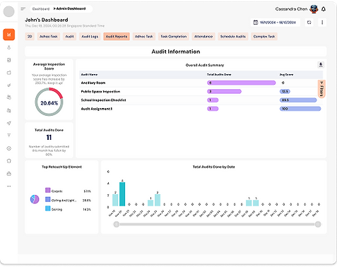
Design Solution 2: Improved Data Visualization
Before

After

Where comparison was necessary, pie charts were replaced with horizontal bar charts. Bar charts support more accurate comparison and require less cognitive effort, especially when multiple values are involved.
After Redesign: "Top Touch-Up Elements" horizontal bar chart with improvements:
Better Chart Type Selection
-
Horizontal bars instead of pie chart (easier comparison)
-
Length is easier to judge than angle (Weber's Law)
-
Supports left-to-right reading pattern
Visual Hierarchy
-
Largest bar (Carpets) draws attention first
-
Color intensity shows relative importance
-
Labels aligned for easy scanning
-
Enhanced Data Presentation
-
Dual metrics: Both edit count (712 edits) and percentage (57.1%)
-
Trend indicators: ↑12% shows change over time
-
Context: "Last 30 days" provides temporal frame
-
Total metric: "1,247 total edits" gives full picture
Actionable Insights
-
Clear ranking shows priorities
-
Trends indicate if issues are increasing
-
Absolute numbers support resource allocation decisions
Design Solution 3: Layout, Spacing, and Gestalt Principles
Before
After
The layout was rebuilt using a consistent grid system with improved alignment and spacing. Related elements were grouped using proximity and similarity to reinforce visual relationships.
Increased white space helps separate sections, reduces visual competition, and supports faster scanning across the dashboard.
Design Solution 4: Progressive Disclosure and Widget Grouping
Before

After

Widgets were reorganized into meaningful categories, such as overview metrics, environmental data, maintenance information, and system performance.
Progressive disclosure ensures that secondary information does not compete with primary KPIs on initial load, reducing cognitive load while keeping deeper data accessible.
Design Solution 5: Semantic Color and Typography Hierarchy
Before

After

A semantic color system was applied consistently to represent critical, warning, normal, and informational states. Color usage was restrained to maintain clarity and avoid visual fatigue.
Typography was also standardized with a clear hierarchy so that primary metrics, secondary values, and labels are immediately distinguishable. Contrast levels were maintained to support accessibility.
Semantic color system:
-
Red (E53E3E) — Critical
Critical alerts, error states, immediate action
Purpose: Signals danger and urgency
-
Amber (ED8936) — Warning
Medium-priority warnings, attention needed
Purpose: Indicates caution without alarm
-
Green (48BB78) — Healthy
Normal system state, positive performance
Purpose: Reassurance and confirmation
-
Blue (4299E1) — Informational
Primary actions, neutral data, navigation
Purpose: Trust, clarity, stability
-
Grey (718096) — Secondary
Supporting content, inactive states
Purpose: De-emphasises non-critical information
Accessibility Considerations:
Color Blindness
Never rely on color alone:
-
Icons accompany colors
-
Text labels provide redundancy
-
Patterns/shapes differentiate
Keyboard Navigation
All interactive elements focusable and operable via keyboard
Screen Readers
Semantic HTML structure:
-
Headings properly nested
-
ARIA labels for status
-
Alt text for all visuals
Cognitive Disabilities
Simple language, clear hierarchy, consistent patterns
Design System Alignment
UX Principles Applied: Design Systems, Consistency, Scalability
Design systems are shared languages. They reduce cognitive load, prevent design drift, and allow users to transfer knowledge across products (Jakob’s Law).


Why It Matters
Consistency
Familiar patterns reduce learning effort
Cognitive efficiency
Users focus on tasks, not the interface
Scalability
Prevents design debt as the product grows
Result:
The dashboard feels familiar, remains easy to maintain, scales across screens, and stays aligned with SIMPPLE’s quality and accessibility standards.
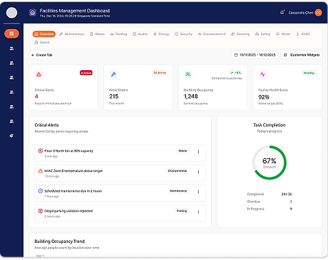
Outcome
Before

After

The redesigned dashboard presents information in a clearer, more structured manner that supports faster comprehension and reduced mental effort.
Key improvements include:
-
Strong alignment with user decision flow
-
Clear visual hierarchy and prioritization
-
Reduced clutter and improved scan efficiency
The result is a dashboard that supports confident monitoring and decision-making rather than requiring constant interpretation.
Reflection and Next Steps
This project demonstrates how applying UX best practices and heuristic analysis can significantly improve complex enterprise dashboards without changing underlying data or functionality.
Future work would include validating the design with real users, measuring time-to-comprehension, and refining responsive behavior across different screen sizes.