
CPF Website Revamp:
Rebuilding Trust Through Design
The Central Provident Fund (CPF) is a cornerstone of Singapore's social security system, supporting citizens and PRs through retirement, healthcare, and housing. Despite its importance, users often experience frustration and confusion navigating the CPF website. This speculative redesign project aimed to rebuild user trust and improve accessibility and comprehension of CPF schemes through a more intuitive and user-focused digital experience.
Note: This is a speculative project and is not affiliated with the CPF Board
The Project
Project Summary
-
Duration: 2 weeks (July 2021)
-
Team Size: 4 members
-
My Roles: User Research, Ideation, Usability Testing, Iteration
Objectives
-
Improve CPF's brand image through better user experience.
-
Increase trust and confidence by providing clear, accessible information.
-
Simplify site navigation and personalise user experience.
Research
We used a mix of qualitative and quantitative methods to understand user pain points:
User Interviews with 22 working adults who had used the CPF site in the past 3 months
Card Sorting Exercise to assess user mental models
Competitive & Comparative Analysis
Online Brand Trust Research
Usability Testing (pre- and post-design)
Key Insights
Widespread CPF illiteracy caused by complex language and confusing site structure
Users lacked trust and often turned to third-party sites
Difficulty in locating personalised, relevant information
Raymond,
the Concerned Future Planner
Age: Early 30s
Life Stage: Newlywed planning for a family
-
Needs
-
A trustworthy, simplified explanation of CPF schemes
-
Personalised information relevant to his life stage
-
Clear guidance without information overload
-
-
Pains
-
Overwhelmed by dense language and poor navigation
-
Distrusts the CPF site and prefers unofficial sources
-
Feels anxious and unprepared for long-term financial planning
-
-
Goals
-
To confidently plan for retirement, housing, and healthcare
-
To find reliable, digestible content in a few clicks
-
To feel in control of his financial decisions
-
Problem Statement
Raymond needs a clear and simple way to understand CPF schemes so he can trust CPF and confidently plan his financial future.
“I don’t even know what CPF is doing with my money.”

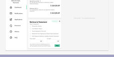
Design Solution
A redesigned, personalised dashboard tailored to life milestones:
-
Shows relevant CPF schemes based on user profile
-
Simplified navigation with guided, contextual content
-
Enables users to find answers quickly without being overwhelmed


Design Process
Information Architecture
Card sorting with 16 users informed a more intuitive structure aligned with how people think about CPF topics.
Click image to enlarge.

UI/UX Design
-
Based on the Singapore Government Design System
-
Prioritised accessibility, clarity, and visual trust
-
Collaborative sketching and design studios strengthened concept development
Usability Testing
Five users tested two main scenarios:
-
Searching for Retirement Sum Top-Up Scheme
-
Customising dashboard to track CPF for mortgage payments
Iterations
-
Search bar: Improved visibility and placement
-
Category bar: Redesigned as a horizontal slider to milestone cards
Click image to enlarge.


Conclusion
Team Reflection
This project highlighted the power of collaboration. Despite the tight timeline, the team worked with mutual respect, clear ownership, and commitment to the user. The outcome was not just a refined prototype—but also a shared sense of purpose.
Next Steps
-
Extend redesign to the rest of the CPF site
-
Apply solutions to the mobile app
-
Measure success via usage data and user feedback
~~ Fin ~~