
Untangling the Interface: A UI/UX Overhaul of the Absolute Boutique Fitness App
Redesigning a cluttered booking experience into a seamless, intuitive interface that puts users back in control.
Course: Specialist Diploma in User Experience & Digital Product Design
Module: MD9124 User Interface Design
Session: AY2024/2025 Semester 2


About the Brand
Absolute Boutique Fitness is a premium studio known for pioneering Singapore’s boutique fitness scene. It was the first to introduce a dynamic mix of Rhythm Cycling and Group Pilates Reformer, positioning itself as a high-energy, community-focused studio.
With outlets across Singapore and a loyal clientele, Absolute has built a reputation for intense, balanced workouts led by passionate instructors.
To manage growing demand, the studio relies solely on its mobile app for class bookings. This app is central to the Absolute experience—but for many users, it has become a recurring source of frustration.
The Problem
Despite its strong brand and offerings, the Absolute app fails to deliver a seamless booking experience. Users struggle to secure class slots due to poor UI, lack of system feedback, and an inefficient flow.
Reviews have been consistently negative for years, yet the app remains the only way to book classes.
Our objective was to identify critical usability issues and redesign the app interface to make the class booking process faster, clearer, and less stressful.

"It’s like the app is designed to stop you from booking a class.”
- User Review
Who We’re Designing For

Lives in: 4-room HDB, Queenstown
Income: $4,600/month
Status: Single, socially active
Fitness Routine: 4–5x/week (Spin + Pilates)
Joined Absolute: During Circuit Breaker
Main Booking Time: 10:00 PM one week before the class she intends to book
Sarah Chen, 25,
Digital Marketing Manager
🎯 Goals
-
Secure preferred class slots before they fill
-
Book entire week’s classes in one sitting
-
Maintain routine despite irregular work hours
-
Switch between locations (home, work, client sites)
-
Alternate between spin and Pilates based on mood/schedule
🧠 Behaviours & Habits
-
Syncs bookings with friends via WhatsApp
-
Uses app mainly on mobile during commute/breaks
-
Sets alarms before booking window
-
Familiar with instructors, but flexible
-
Values speed and clarity in booking flow
😣 Pain Points
-
App lags at peak (10:00 PM)
-
Difficult to book multiple classes quickly
-
Seat selection errors lead to missed spots
-
Location selection is non-intuitive
-
No real-time slot availability or feedback
-
Must manually refresh repeatedly
✅ Needs
-
Fast, lag-free booking
-
Real-time slot availability
-
Easy location switching
-
Quick multi-class booking
-
Clear feedback on booking status
-
Reliable navigation (back, exit, reset)
-
Prominent, responsive CTAs
Research Insights
We conducted a usability audit, heuristic evaluation, and competitor benchmarking. The findings were consistent:
-
Booking is location-dependent, with no quick way to compare class types across outlets
-
Seat availability isn’t updated in real-time, often leading users to unknowingly select full classes
-
No feedback or confirmation after key actions
-
Buttons, fonts, and layouts are inconsistent and inaccessible on newer devices
-
Key CTAs like “Join Waitlist” are too small or unclear
User effort analysis scored the current booking process at 62—an excessive cognitive load for a routine task.


Strategy and Design Principles
We framed our core challenge as a “How Might We”:
How might we streamline the class booking process to ensure users can efficiently secure their preferred slots without frustration?
Our goals:
-
Reduce user effort by at least 40%
-
Improve clarity and navigation
-
Align visual design with Absolute’s energetic, inclusive brand
Design principles used:
-
Clarity over complexity
-
Consistency in components and hierarchy
-
Mobile-first accessibility
-
Actionable feedback and visibility of system status
Redesign:
From Frustration to Flow
Style Guide
Typography:
Helvetica – bold, universal, legible


Colours:
-
Primary – Orange #E94E0B
Represents energy, urgency, action -
Accent – Turquoise #48B5B9
Adds balance, calmness, and freshness -
Secondary – Charcoal Black #241F1F
Grounds the interface, ensures contrast -
Tertiary – Light Grey #EEEDED
Used for backgrounds and subtle dividers

Layout:
4-column grid for visual alignment

Brand Archetype:
The Hero
Absolute stands for strength, transformation, and motivation.
Our redesign reflects a bold, determined personality that empowers users to take control of their fitness journey.

Simple Icons:
Straightforward icons that communicate purpose instantly—no guesswork, no clutter. Just intuitive visual cues that guide users effortlessly.

Clear CTAs
Buttons are clean and direct. No fluff—just clear, purposeful CTAs that help users take action confidently and efficiently.

Redesign:
UI Improvements & Heuristic Fixes
Our redesigned prototype focused on the booking journey. The updated UI:
-
Allows multi-location class filtering
-
Displays real-time class availability
-
Provides consistent visual hierarchy and feedback
-
Supports devices of all screen sizes
-
Reduces unnecessary steps and mental effort
-
User effort score dropped from 62 to 37, a 40%+ improvement in booking efficiency.
Heuristic Issue | Before | Solution |
|---|---|---|
Unclear CTAs | Buttons were uniform, lacked hierarchy | Clear visual difference between primary and secondary CTAs |
Poor feedback | No confirmation after booking | Added system status indicators and success modals |
Navigation issues | No back or exit options in class view | Introduced consistent back buttons and navigation headers |
No real-time data | Seat info outdated, needed app restart | Added refresh button to update seat availability |
Small tap targets | Users missed "Join Waitlist" often | Enlarged buttons with clearer positioning |
Low accessibility | Font sizes and contrast failed WCAG | Adjusted for readability and responsiveness |
Visuals
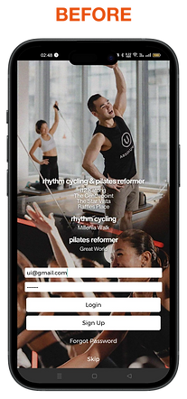


Login Page
-
Text sizing is inconsistent – Login/Sign Up are too small and less noticeable than location names.
-
Visual hierarchy is off – key actions aren't standing out enough.
-
Button hierarchy unclear – users can’t easily tell which CTA is primary.
-
No password reveal option – increases error risk, especially on mobile.
Fixes: standardise text size (min. 16pt), prioritise key actions visually, make primary CTA obvious, add password toggle.
Login Page - Error
-
Issue: Error messages don’t follow standard colour conventions — missing red or amber tones.
-
Impact: Errors aren’t visually distinct, so users may overlook them or not realise what went wrong.
-
Fix: Apply conventional warning colours (e.g., red for errors) to align with user expectations and improve visibility.


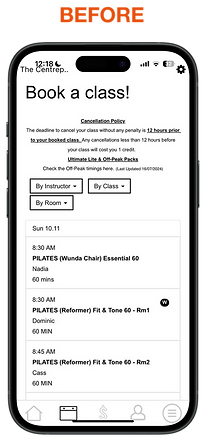
Home Page
Page Header Visibility
- Heuristic: Consistency and Standards
-
Issue: Page headers are hidden on some devices (e.g., iPhones) due to the top bar.
-
Fix: Adjust layout so headers remain visible across devices for better orientation.
-
-
Undifferentiated Buttons
-
Heuristic: Recognition Rather than Recall
-
Issue: All buttons look the same — no visual hierarchy.
-
Fix: Vary button styles to highlight primary actions and guide users intuitively.
-
-
Cluttered Navigation & CTA Repetition
-
Heuristic: Aesthetic and Minimalist Design
-
Issue: CTAs are duplicated across the screen and bottom nav, adding visual clutter.
-
Fix: Simplify navigation and remove redundant CTAs. Consider making the Reserve page the default landing screen.
-
Class Booking
1. Location Button Not Obvious
-
Heuristic: Consistency and Standards
-
Issue: 'The Centrep…' button is truncated and doesn’t look tappable.
-
Fix: Redesign it to clearly show it’s the selected location and interactive.
2. No Exit or Back Function
-
Heuristic: User Control and Freedom
-
Issue: Users can’t exit or go back easily from the class page.
-
Fix: Add clear back/exit buttons — don’t force reliance on bottom nav.
3. Button Access Issues on Certain Devices
-
Heuristic: Consistency and Standards
-
Issue: Buttons like 'Settings' aren’t tappable on some devices (e.g., iPhone 14 Pro).
-
Fix: Fix layout so all interactive elements are accessible across screen sizes.
4. Overwhelming, Flat UI
-
Heuristic: Aesthetic and Minimalist Design
-
Issue: No visual hierarchy — hard to tell which day you’re on or how to browse others.
-
Fix: Clarify current day, simplify nav, enable filtering, and show real-time class availability.
5. Poor Colour Contrast
-
Heuristic: Consistency and Standards
-
Issue: Low contrast makes key buttons like ‘Add to Waitlist’ hard to see.
-
Fix: Improve colour contrast to ensure visibility and accessibility.
6. System Back Button Misdirects
-
Heuristic: User Control and Freedom
-
Issue: Back button takes users to the home screen instead of previous page.
-
Fix: Add dedicated in-app back button that follows expected flow.
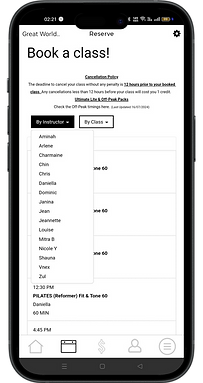


Class Waitlist and Status
-
Consistency and Standards
-
Colour contrast for the ‘Add to Waitlist’ button is poor; blends into background.
→ Fix: Improve contrast to meet accessibility standards. -
No standard back navigation—system back button exits to home instead of previous page.
→ Fix: Add a visible back button to maintain consistent navigation patterns.
-
-
User Control and Freedom
-
Users can’t easily return from class detail page.
→ Fix: Add a dedicated exit/back button for quick returns. -
Selecting already-booked seats wastes time due to lack of availability updates.
→ Fix: Add a refresh function to check seat availability before confirmation.
-
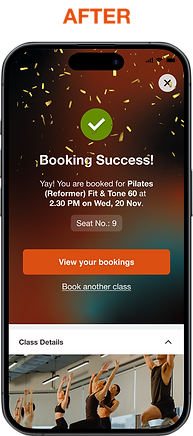
Class Booking & Confirmation
Heuristic: Match Between System and the Real World
Issue 1:
-
The “Reserve a Spot” button appears even when the user is already booked.
-
Solution: Remove the button to align with real-world logic and reduce user confusion.
Issue 2:
-
No clear feedback after booking a class.
-
Solution: Introduce a simple confirmation animation (e.g. checkmark or success tick) to reassure users that their action was successful.


Looking Ahead
This redesign is just the beginning. Absolute can expand beyond bookings and become a full-fledged fitness companion:
-
Workout tracking and weekly fitness goals
-
Gamified challenges and rewards
-
Community features like group class planning
-
Nutrition tips tailored to fitness goals
By reducing friction and adding value, Absolute can turn its app into a core part of the user’s fitness lifestyle—not just a scheduling tool.
Link to full presentation deck here
~~ Fin ~~